
A usability-focused redesign of Goodreads aimed at improving how users discover features, complete reading-related tasks, and navigate community content — translating research insights into streamlined interaction flows.
Despite being a feature-rich platform, Goodreads suffers from poor discoverability and unclear interaction design. Through research, we identified four recurring failure patterns:
Users struggling to find core actions — reviewing, previewing, reading interviews
Confusion between navigation categories such as Library vs To Read
Weak visual affordance for interactive elements — thumbnails mistaken as static
High reliance on trial-and-error navigation rather than confident discovery
How might we reduce cognitive load and improve discoverability in key Goodreads reading flows?
Six participants (ages 19–26) familiar with Goodreads, Kindle, and Wattpad-style platforms completed three task-based usability sessions while verbalizing their experience through think-aloud protocol.
6 participants explored reading habits, platform expectations, and navigation strategies.
Participants verbalized thoughts in real time, surfacing confusion and hesitation points.
Three representative flows evaluated: writing a review, previewing a book, reading an author interview.
Users rarely failed tasks due to inability — but due to not finding features quickly. Review actions were not immediately visible, the preview feature was hidden in deeper layers, and community interviews were poorly surfaced.
Participants expected patterns from Kindle, social media, and streaming apps. They expected direct "Read/Preview" actions on cards, clearer "Read more" affordances, and misinterpreted navigation labels like "Community."
Users hesitated when elements didn't clearly signal clickability. Thumbnails were mistaken as static images, buttons were visually under-emphasized, and hover/interaction cues were absent.
More steps consistently led to backtracking, mis-clicking tabs, and abandoned exploration paths — confirming that depth was directly correlated with failure rate.
Research led directly to four core design decisions, each mapped to a specific failure pattern observed across participants.
Make "Review," "Preview," and "Read" actions immediately accessible on primary surfaces.
Match expectations from Kindle-style reading interfaces and feed-based social platforms.
Stronger visual cues for clickable elements — buttons, cards, and thumbnails must signal interactivity clearly.
Minimize the number of steps between discovery and action completion across all three flows.
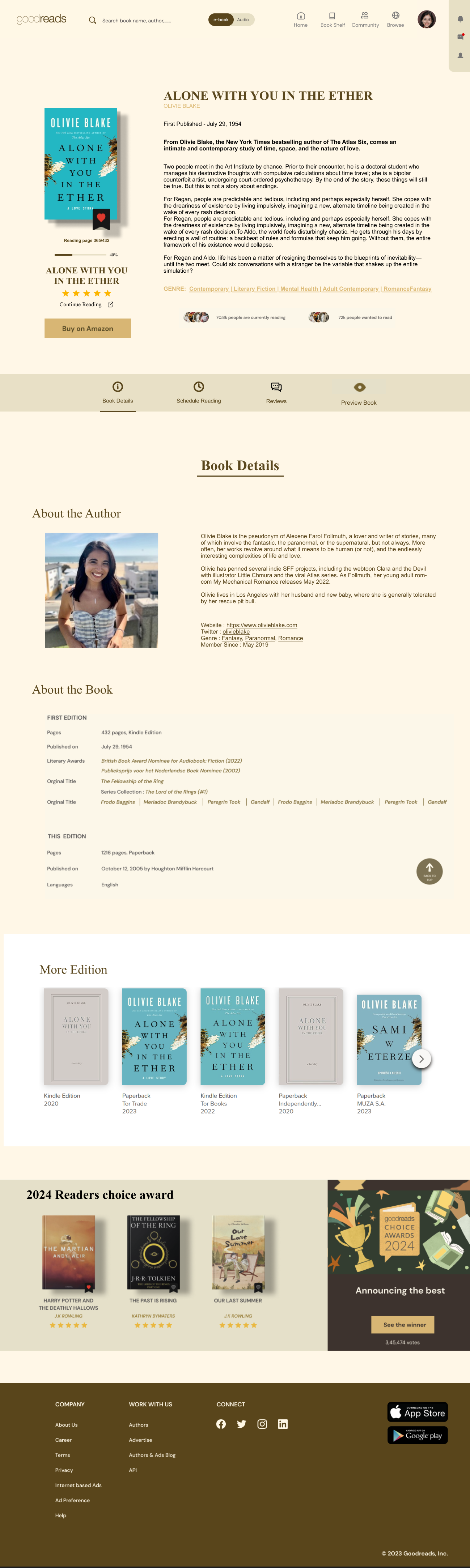
Added clearer entry points and submission clarity directly on book pages — eliminating the need to navigate away to initiate a review.
Moved preview access directly onto "To Read" shelf cards so users can preview without leaving their reading list.
Reframed author interviews with explicit clickable affordances and surface-level placement — removing the need for deep navigation.
Improved contrast and interaction signaling across all components — making active elements visually distinct from static content.
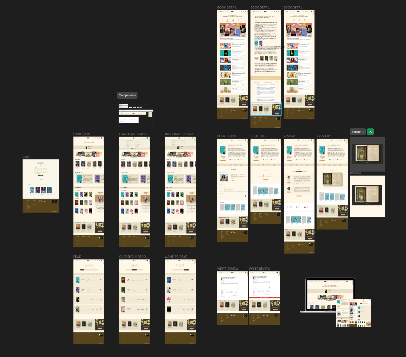
Each screen reflects a direct research intervention — surfacing hidden actions, clarifying labels, and reducing the number of steps to complete key tasks.
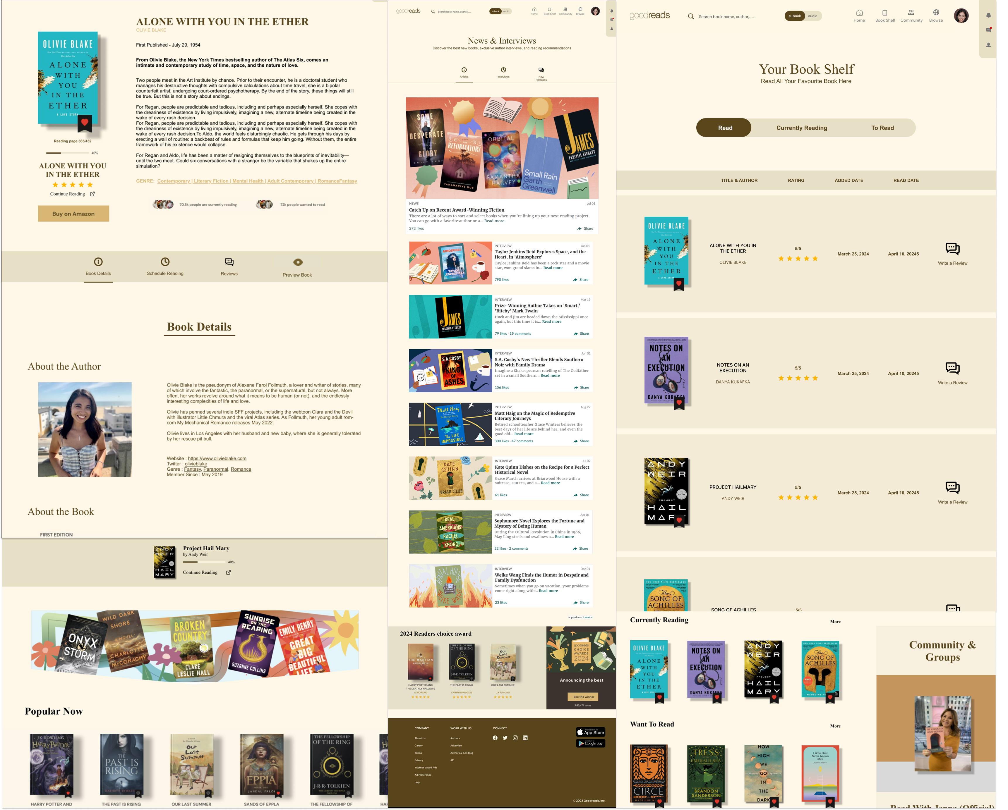
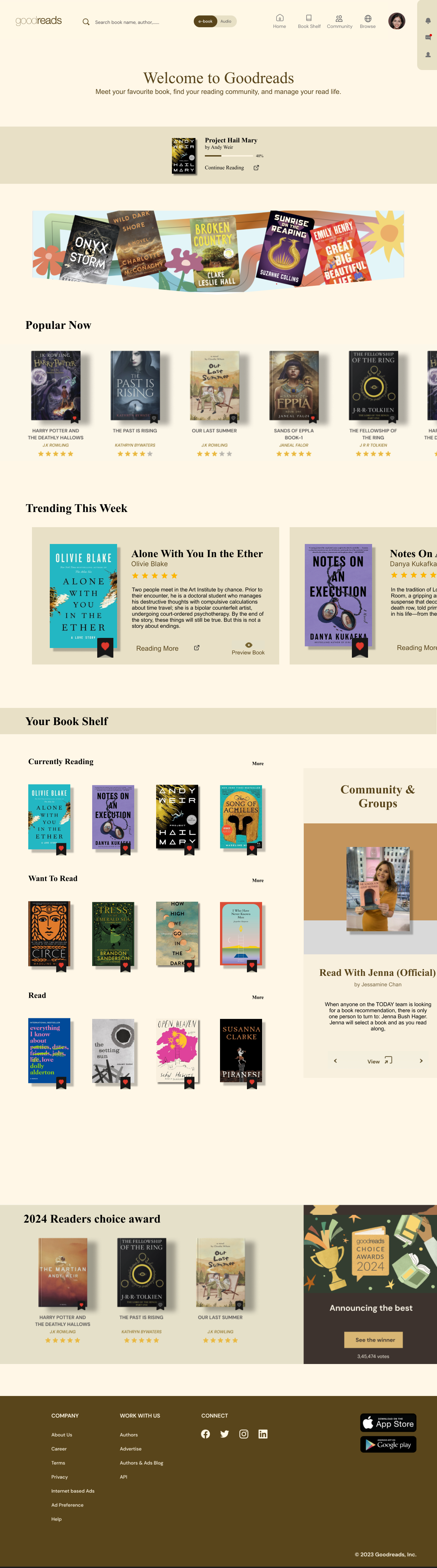 Home Dashboard
 Book Detail
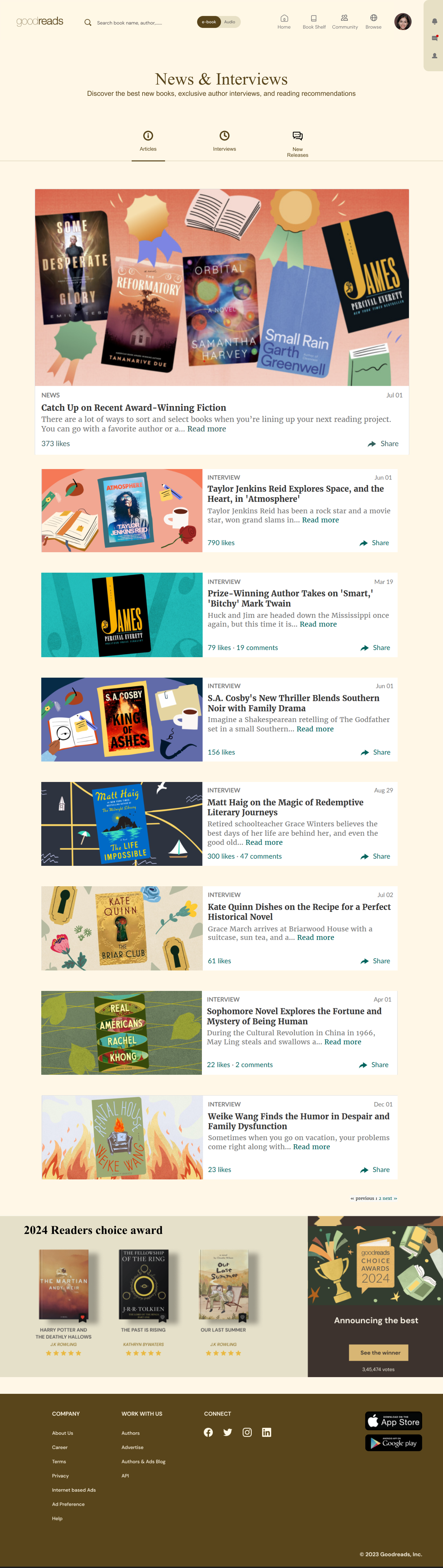
 News & Interviews
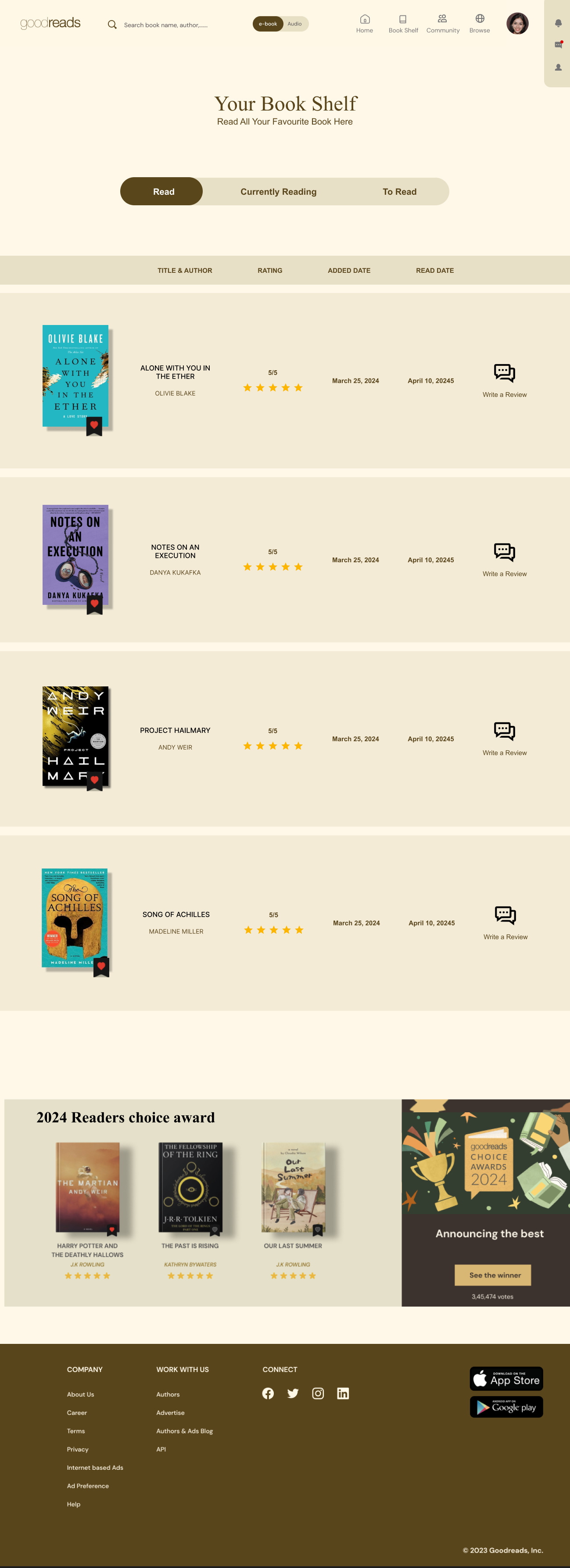 Your Book Shelf
The redesign spans the full reading journey — from discovery on the home feed to managing your bookshelf and engaging with community content.
The complete prototype layout — every redesigned screen mapped together to verify visual consistency, hierarchy, and design system coherence.
Usability testing after the redesign showed faster task completion, reduced hesitation during navigation, fewer mis-clicks, and higher confidence in identifying interactive elements.
All participants successfully located and completed the review flow.
Strong improvement in preview discoverability from the "To Read" shelf.
Author interviews surfaced earlier and were identified as clickable by most participants.
The redesign demonstrates that usability issues in mature platforms are often not caused by missing functionality — but by poor discoverability and weak interaction signaling. Small structural changes significantly improved navigation clarity, task efficiency, and user confidence.
Users don't fail because the feature doesn't exist. They fail because they can't find it.
n=6 limits statistical generalizability — findings are directional, not definitive.
Results may not reflect the broader Goodreads user base, including older readers and casual users.
Participants interacted with a Figma prototype — real system behaviors like load time and error states were absent.
Predefined tasks may not capture how users naturally explore the platform in unguided sessions.
The Goodreads redesign reinforced that the gap between a functional product and a usable one often comes down to clarity, hierarchy, and the invisible work of making interactions feel obvious. Research-driven design doesn't just improve metrics — it respects the user's time and attention.